For many companies in Thailand, a website is no longer judged first on a desktop screen. It is judged on a phone, often in a fast, distracted moment when a potential customer is comparing options, checking credibility, or trying to complete a simple action. That changes the standard for good design.
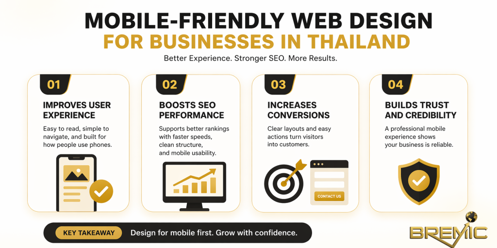
Mobile-friendly web design for businesses in Thailand is not just about making a site “fit” on a smaller screen. It is about building a digital experience that loads quickly, feels intuitive, supports search visibility, and makes it easy for users to take the next step. If the mobile experience is weak, rankings can suffer, engagement drops, and conversions become harder to earn.
This article explains what mobile-friendly design really means in practice, why it matters for SEO and business performance, and how to approach it strategically rather than cosmetically.
What Is Web Design?
Web Design is the process of planning and creating how a website looks, feels, and functions for the user. That includes layout, navigation, typography, page structure, calls to action, forms, imagery, and the way content behaves across different devices.
In practical terms, good Web Design helps people find what they need with minimal friction. It supports both usability and business goals. A well-designed site is easier to navigate, easier to trust, and easier to convert on.
When we narrow that down to mobile-friendly web design for businesses in Thailand, the focus becomes more specific. The site must work smoothly on smartphones and tablets, not as a reduced version of the desktop site, but as a primary experience in its own right. That means content hierarchy, button size, menus, page speed, and form design all need to be considered from a mobile-first perspective.
Why It Matters
Mobile experience affects first impressions
A visitor does not separate “design” from “business credibility.” If a website feels cramped, slow, or confusing on mobile, the business itself appears less reliable. That is especially important for service businesses, local companies, hospitality, healthcare, education, and B2B firms trying to build trust before a call or inquiry.
It supports SEO performance
Google evaluates websites based on user experience signals and mobile usability. A site that is difficult to use on mobile may struggle to perform as well in organic search, especially when users return to the results because the experience is poor.
Mobile-friendly web design for businesses in Thailand also supports the wider SEO system behind a site. It improves crawlable page structure, makes content easier to consume, and reduces friction that can weaken engagement metrics. On a broader topical-authority site, it also helps cluster pages perform better because users can move between related articles without usability problems.
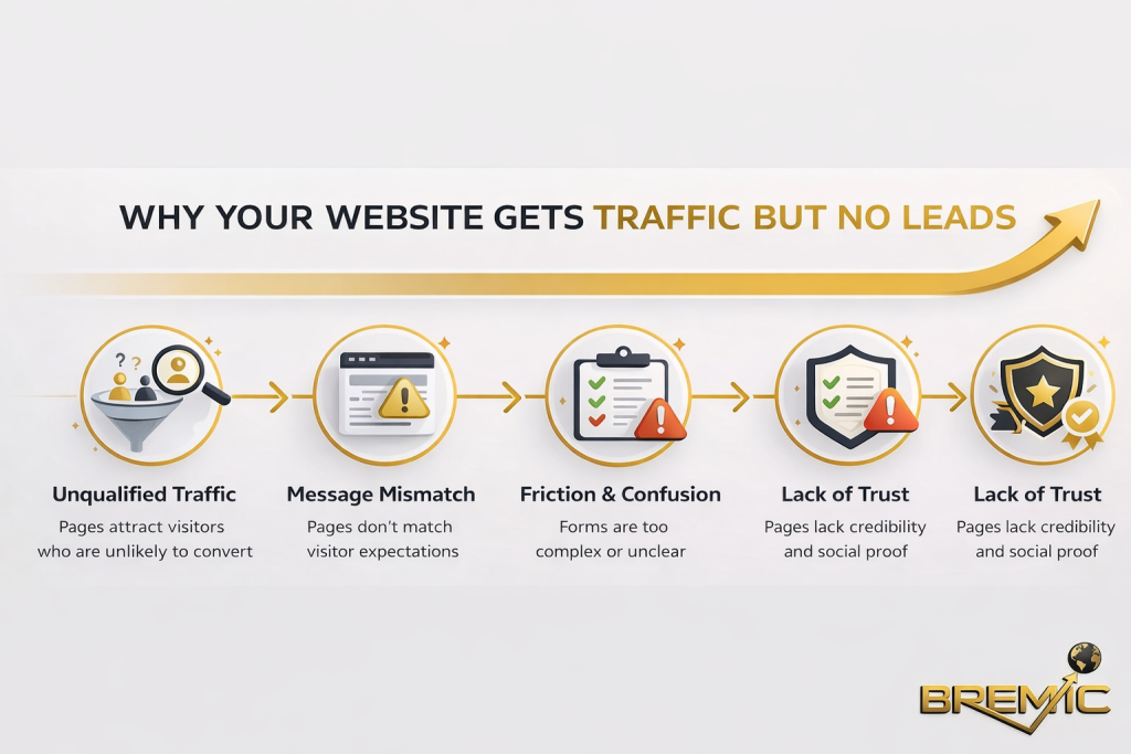
It improves conversions, not just traffic
A page can attract visitors and still fail commercially. Design quality influences whether people complete forms, call the business, request a quote, or continue exploring the site. Mobile design matters most at those decision points.
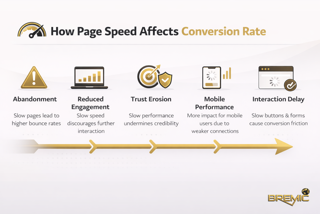
If the contact button is hard to find, the form is too long, the menu is unclear, or the page loads slowly, users often leave before the business has a real chance to convert them.
How It Works and How to Apply It
Start with a mobile-first structure
Many websites are still designed desktop-first and then adjusted for mobile later. That usually creates compromises. A stronger approach is to decide what the mobile user needs first.
That means asking a few practical questions:
- What is the main task on this page?
- What information must be visible immediately?
- What can be simplified, collapsed, or removed?
- What action should the user take next?
On mobile, clarity matters more than visual complexity. The page should communicate its purpose quickly, with a clear heading, readable copy, and an obvious next step.
Build responsive layouts properly
Responsive design allows a website to adapt to different screen sizes without breaking layout or usability. But simply having a responsive theme is not enough. Many businesses assume their site is mobile-friendly because it technically resizes. In reality, a responsive layout can still create poor user experiences if text is too small, buttons are too close together, or important elements are pushed too far down the page.
Effective responsive Web Design pays attention to:
- readable font sizes
- spacing between interactive elements
- menu behavior
- image scaling
- form usability
- content hierarchy on smaller screens
This is where good design becomes strategic. A mobile layout should not just shrink content. It should reorganize content.
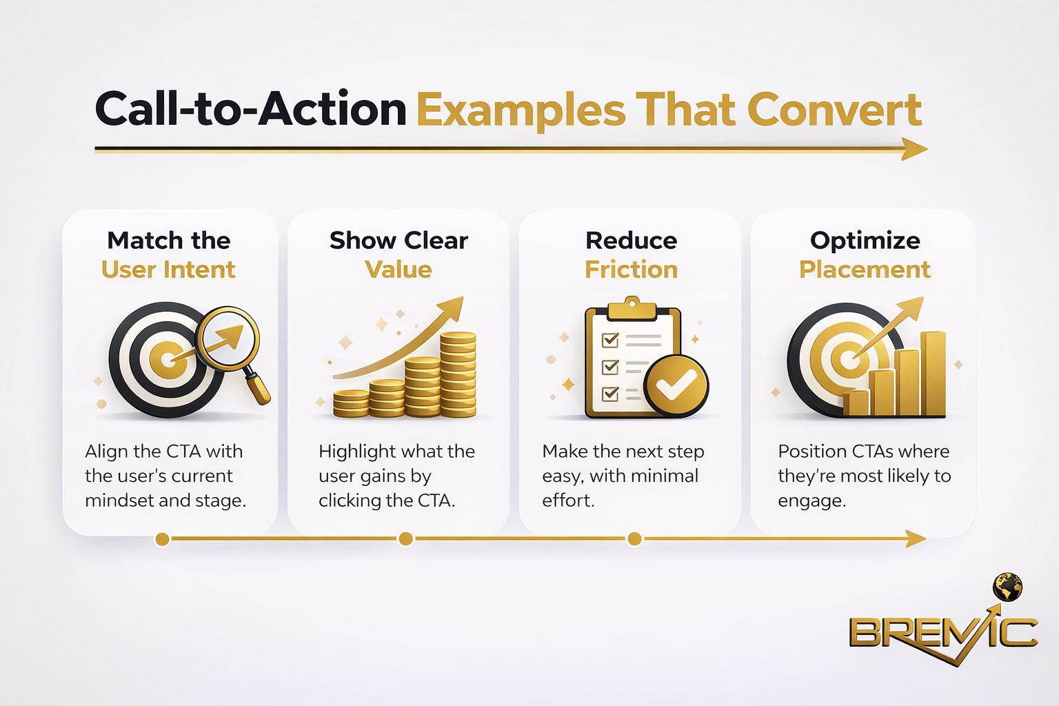
Reduce friction in key actions
The mobile version of a page should make high-intent actions easy. For many businesses in Thailand, those actions may include calling, sending an inquiry, opening a map, contacting the company on messaging platforms, or requesting a quote.
A common mistake is treating the call to action as a design detail rather than a conversion path. The best mobile-friendly web design for businesses in Thailand places business-critical actions where users can access them quickly without scrolling through unnecessary clutter.
Keep pages fast and technically clean
Speed is part of design, not a separate technical issue. Heavy image files, bloated scripts, intrusive popups, and poorly structured templates create friction that hurts both SEO and usability.
A fast mobile page usually comes from disciplined choices:
- properly sized images
- fewer unnecessary animations
- lighter templates
- limited third-party scripts
- stable layout behavior
- clean code and hosting decisions
If design choices make the site slower, the design is working against the business.
Important Subtopics
Content hierarchy on mobile
Mobile users do not read a page the same way desktop users do. They scan quickly. That means the most important information should appear early, and supporting detail should follow in a logical sequence.
A strong hierarchy usually includes:
Clear headings and short sections
Long walls of text are harder to process on mobile. Breaking content into short sections with strong headings improves readability and helps search engines understand topical structure.
Immediate relevance above the fold
The first screen should answer the user’s basic question: am I in the right place? That does not mean forcing everything into the top section. It means making the page purpose obvious.
Strong internal paths
On a content-led website, mobile design should support internal linking naturally. If a page about mobile-friendly web design sits within a broader Web Design cluster, users should be able to move easily to related pages such as responsive design, website speed, UX design, local SEO, or conversion-focused landing pages.
Local usability for Thai businesses
A business website in Thailand often serves a mixed audience: local users, expats, tourists, regional partners, or international buyers depending on the industry. That affects design decisions.
Practical considerations may include:
- bilingual or multilingual navigation
- mobile-friendly location and contact details
- click-to-call functionality
- map integration
- clear service-area information
- simple inquiry forms for users on the move
The right design depends on the business model. A hotel, clinic, law firm, manufacturer, and real estate agency will each need a different mobile flow. Good strategy starts with user intent, not generic design trends.
Trust signals on smaller screens
Trust elements are often underused on mobile. Reviews, credentials, client logos, company details, FAQs, and clear service descriptions all matter, but they need to be placed carefully so they support conversion rather than distract from it.
On mobile, trust should be visible without overwhelming the page.
Common Mistakes
One of the biggest mistakes is assuming that a modern-looking site is automatically effective. Visual polish alone does not make a site mobile-friendly.
Another common problem is overloading the interface. Too many popups, sticky elements, banners, or competing calls to action can make the page feel crowded and difficult to use.
Businesses also often ignore form design. A form that feels acceptable on desktop can become frustrating on a phone. Too many fields, poor spacing, unclear labels, and awkward input behavior can quietly damage lead generation.
There is also a strategic mistake: separating design from SEO. When Web Design and SEO are treated as unrelated tasks, the result is often a website that looks good but performs weakly in search, or ranks reasonably well but converts poorly. The stronger approach is to plan structure, content, and design together.
Practical Guidance
The most effective approach is to treat mobile design as part of a broader website performance strategy.
Start by reviewing your highest-value pages on a phone, not in a browser preview. Look at the homepage, service pages, key landing pages, and contact path. Ask whether the next step is obvious, whether the copy is easy to read, and whether anything slows the experience down.
Then work through priorities in order:
- Fix usability problems on key commercial pages first.
- Improve page speed and simplify unnecessary design elements.
- Strengthen content hierarchy so users can scan quickly.
- Make internal links easier to access within the content flow.
- Refine trust signals and calls to action for mobile visitors.
For businesses building topical authority, this matters beyond a single page. If your site uses a pillar-and-cluster structure, each cluster article should feel easy to read and navigate on mobile. That improves the user journey across the whole topic area, not just one URL.
Timing and Expectations
Improvements from mobile-friendly web design do not always appear overnight, and they do not all show up in the same way.
Usability gains can have an immediate effect on engagement and conversions once the new design is live. SEO improvements may take longer, especially if they depend on broader site quality, content strength, crawlability, internal linking, and competition level.
It is also worth being realistic: better design does not compensate for weak positioning, thin content, or unclear offers. It supports performance, but it works best when combined with solid SEO fundamentals and a site structure built around search intent.
Conclusion
Mobile-friendly web design for businesses in Thailand is not a design trend. It is a practical business requirement tied directly to visibility, trust, and conversion performance.
The strongest websites do not just look responsive. They are structured around mobile user behavior, clear content hierarchy, fast loading, and low-friction decision paths. That is what turns Web Design into a performance asset rather than a cosmetic layer.
For businesses that want sustainable growth, the goal should not be to make the site merely acceptable on mobile. The goal should be to make mobile the standard by which the website is planned, written, and improved. That is the approach most likely to support both SEO and real commercial outcomes over time.


