A business website does not need to be visually complex to perform well, but it does need to work. That is where many companies go wrong. They invest in a polished homepage, add a few service pages, and assume the job is done. In practice, weak Web Design decisions often undermine trust, search visibility, and conversion performance long before traffic becomes the problem.
For Thai businesses, the issue is not just aesthetics. A poorly structured site can make it harder to rank, harder to communicate value, and harder for users to take action. This is especially true for companies competing in crowded local or regional markets where buyers compare several providers before making contact.
This article breaks down the most common website-design-mistakes-thai-businesses-make, why they matter, and how to fix them strategically rather than cosmetically.
What Is Web Design
Web Design is the planning and creation of how a website looks, feels, and functions for users. In practical terms, it covers layout, navigation, page structure, content presentation, calls to action, mobile usability, and visual hierarchy.
Good Web Design is not simply about making a website look modern. It is about helping the right visitor understand the offer quickly, move through the site easily, and complete a useful action with confidence.
That means effective design sits at the intersection of three priorities:
- user experience
- business goals
- technical and SEO performance
A site can look attractive and still fail if it loads slowly, hides important information, or makes users work too hard to find answers. Strong design reduces friction. Weak design introduces it.
Why It Matters
When people search for a service, compare suppliers, or validate a business, the website often becomes the deciding factor. Even when leads come from social media, referrals, or paid ads, the site usually plays a credibility role before contact happens.
From an SEO perspective, Web Design affects far more than appearance.
It influences crawlability and site structure
Search engines rely on clear navigation, clean internal linking, logical page hierarchy, and accessible content. If the site is confusing for users, it is often confusing for search engines as well.
It affects engagement signals
When users land on a page and immediately feel lost, they leave. That does not automatically mean a ranking drop on its own, but poor engagement often reflects a deeper mismatch between search intent, content structure, and usability.
It shapes trust and conversion
For many service businesses, conversion depends on confidence. If pricing is vague, service pages are thin, contact options are hidden, or the site feels outdated, visitors hesitate. Design problems often look like lead-generation problems because they block decision-making.
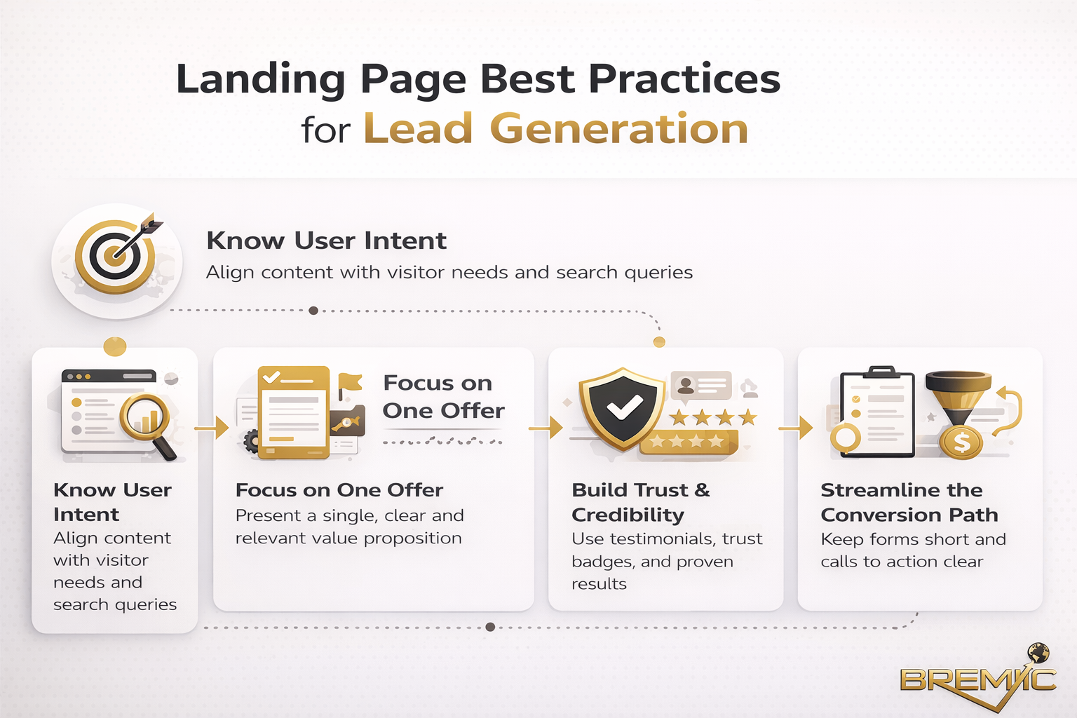
How Web Design Should Work in Practice
A good business website should guide the visitor through a simple sequence.
First, it should clarify what the business does and who it helps.
Second, it should make the offer credible through clear information, proof, and structure.
Third, it should lead the visitor toward the next step without friction.
That sounds straightforward, but many of the website-design-mistakes-thai-businesses-make happen when one of those stages breaks down.
Clear messaging comes before decoration
A homepage banner with a large image and a vague slogan may look clean, but it often fails the most basic test: can a first-time visitor understand the business in a few seconds?
Design should support clarity, not replace it. Headlines, service summaries, location relevance, and conversion paths need to appear early and clearly.
Navigation should reflect buyer intent
Users do not browse websites the way business owners imagine they do. They look for answers to immediate questions:
- What do you offer?
- Are you credible?
- Can you help someone like me?
- How do I contact you?
- What happens next?
A practical navigation system anticipates those questions. It does not bury them under clever labels or oversized menus.
Content and design must work together
Many businesses treat design and content as separate tasks. In reality, the strongest websites are built around content architecture. Service pages, trust elements, FAQs, case studies, and contact pathways should shape the design from the beginning.
When content is added after the layout is already fixed, pages often become awkward, thin, or inconsistent.
Important Subtopics Thai Businesses Often Overlook
Mobile-first usability
For many businesses in Thailand, mobile is the primary experience, not a secondary one. A desktop-first design that merely shrinks onto a phone is not enough.
Buttons need to be tappable. Text must remain readable. Forms should feel easy to complete. Key actions such as calling, messaging, or requesting a quote should be visible without hunting around the page.
A site that feels acceptable on desktop but frustrating on mobile is already underperforming.
Local trust signals
Trust is often built through small details. Many Thai business websites miss this entirely. They show generic claims but provide little evidence.
Useful trust signals may include:
- a real business address or service area
- company registration details where relevant
- team photos or real project images
- client testimonials with context
- clear contact channels
- bilingual or audience-appropriate content where needed
These are not decorative additions. They reduce uncertainty.
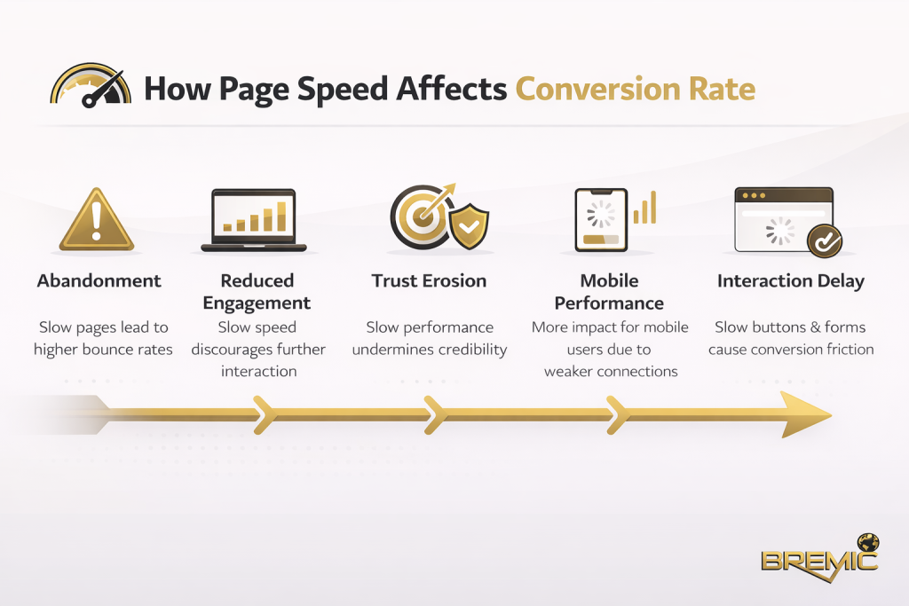
Page speed and technical simplicity
Heavy animations, oversized images, auto-playing video, and bloated themes often create an expensive-looking site that performs poorly. Slow websites damage user experience and can weaken SEO performance over time.
Good Web Design usually feels simpler than people expect. It focuses on speed, readability, and clarity rather than unnecessary motion.
Common Mistakes
Designing for appearance instead of outcomes
This is one of the most common website-design-mistakes-thai-businesses-make. The site is judged internally by whether it looks impressive, not by whether it helps users take action.
A visually polished site with weak structure is still weak. Design should be evaluated against business outcomes such as qualified leads, clearer service understanding, stronger local visibility, and easier navigation.
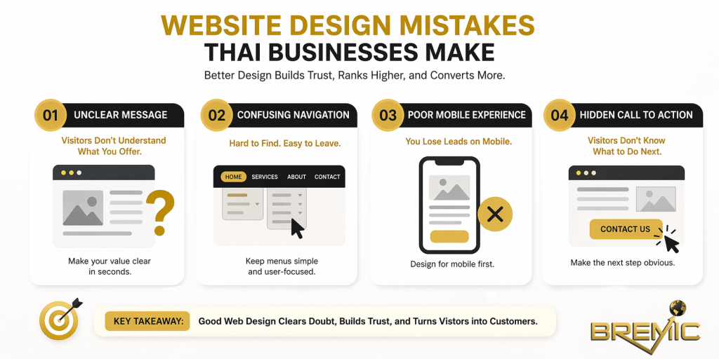
Weak homepage messaging
Many homepages open with generic phrases like “quality service” or “professional solutions.” These say very little. If the first screen does not explain what the company does, who it serves, and why it is relevant, visitors are forced to interpret the site for themselves.
That extra effort reduces trust.
Confusing navigation
Menus often become cluttered because every internal stakeholder wants visibility. The result is a navigation system built around internal preferences rather than user needs.
Too many top-level items, unclear labels, and duplicated content paths make the site feel harder to use than it should.
Treating every page the same
Not every page has the same job. A homepage, service page, location page, about page, and blog article each serve different user needs. When they all follow the same template without strategic adjustment, the site loses relevance and clarity.
A service page should help someone evaluate an offer. A blog article should answer an informational query. A contact page should remove friction. Good Web Design respects those differences.
Ignoring SEO during the design process
Some businesses finish the site design first and “do SEO later.” That usually creates avoidable problems: thin page structure, poor internal linking, missing content areas, weak heading hierarchy, and pages that do not match search intent.
SEO is not something layered on top of design at the end. It should shape page architecture from the start.
Over-reliance on stock visuals and generic copy
If the site looks interchangeable with dozens of others in the market, it becomes harder to trust. Generic design and generic language create the impression of a generic business.
That does not mean every site needs elaborate branding. It means the website should reflect the real business clearly enough to feel specific and credible.
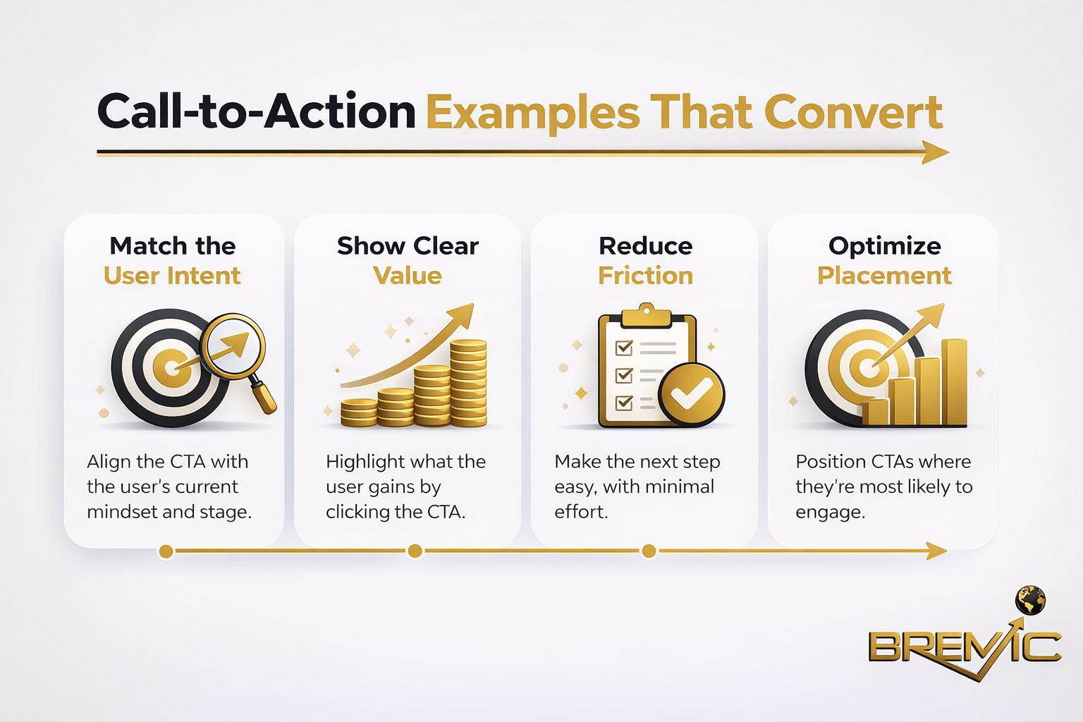
Hiding the call to action
A common mistake is assuming users will naturally figure out what to do next. They often do not. If the call to action is buried at the bottom of the page, hidden in the menu, or diluted by too many options, conversions suffer.
The next step should feel obvious and low-friction.
Practical Guidance
A stronger approach starts with strategy, not templates.
Begin by identifying the core page types the site actually needs. For most service businesses, that means a homepage, clear service pages, an about page, proof-based trust content, and a friction-free contact path. From there, structure content around the buyer journey rather than internal departments.
Then review the site through five practical questions:
Can a new visitor understand the business quickly?
The answer should be visible in headlines, page introductions, and navigation labels.
Can users find the most important pages easily?
Core services and trust-building content should not be buried.
Does each page support a specific intent?
Informational pages should educate. Commercial pages should help decision-making. Contact pages should remove hesitation.
Does the design strengthen credibility?
Use real examples, practical details, and consistent messaging. Avoid visual choices that distract from substance.
Is the site technically lean?
Prioritize speed, responsive behavior, clean structure, and accessibility over feature-heavy design trends.
For businesses building topical authority, content architecture matters as much as page layout. Informational articles should connect naturally to relevant service or category pages, and those core pages should support the broader cluster. That is where design and internal linking work together.
Timing and Expectations
Improving Web Design can create immediate usability gains, but business results usually appear in stages.
Some improvements, such as clearer calls to action or better mobile usability, may affect conversion behavior fairly quickly. SEO-related improvements usually take longer because search engines need time to crawl, interpret, and reassess the site.
That is why redesign decisions should not be judged only by short-term visual feedback. A better site structure often pays off gradually through stronger rankings, better engagement, and more consistent lead quality.
The key is to measure outcomes realistically. Look at user behavior, page performance, conversion paths, and search visibility over time rather than expecting instant transformation.
Conclusion
The real problem behind most website-design-mistakes-thai-businesses-make is not bad taste. It is lack of alignment. The design looks one way, the content says another, the navigation supports neither, and the result is a site that underperforms even when traffic exists.
Good Web Design is strategic. It helps search engines understand the site, helps users trust the business, and helps the business convert attention into action. For Thai companies trying to grow online, that matters far more than chasing design trends.
A website should not just look professional. It should function like a credible, structured business asset. That is the standard worth building toward.