A strong call to action can be the difference between a page that attracts traffic and a page that produces business results. Many websites publish useful content, earn rankings, and generate visits, yet still underperform because the next step is unclear, weak, or poorly matched to user intent.
That is why studying call-to-action examples that convert matters. A CTA is not just a button or a line of copy at the end of a page. It is a strategic instruction that moves a visitor from passive interest to meaningful action. When done well, it improves the commercial value of your traffic without undermining the user experience. When done badly, it creates friction, lowers trust, and wastes the attention you worked hard to earn through SEO.
This article explains how CTAs fit into Conversion Rate Optimization (CRO), why they matter for search-driven websites, how to write them more effectively, and what mistakes to avoid if your goal is to turn traffic into leads, signups, or sales.
What is Conversion Rate Optimization (CRO)?
Conversion Rate Optimization (CRO) is the process of improving a website so that a higher percentage of visitors complete a desired action. That action might be filling out a form, booking a call, starting a free trial, requesting a quote, downloading a resource, or making a purchase.
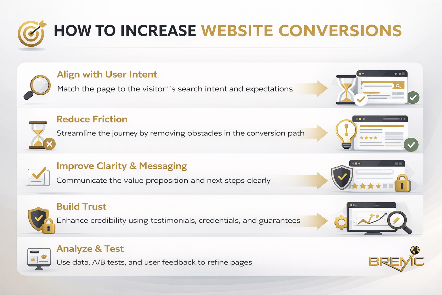
In practical terms, CRO is about reducing friction and increasing clarity. It looks at what users are trying to do, what stops them from doing it, and how pages can be improved to support better decisions.
A CTA sits at the center of that process. It translates user intent into action. If a visitor lands on a page from search, reads the content, and finds it useful, the CTA is the moment where your page either capitalizes on that interest or lets it fade.
That is why call-to-action examples that convert are not just copywriting inspiration. They are part of a broader CRO system that includes message match, page structure, trust signals, design hierarchy, and audience intent.
Why it matters
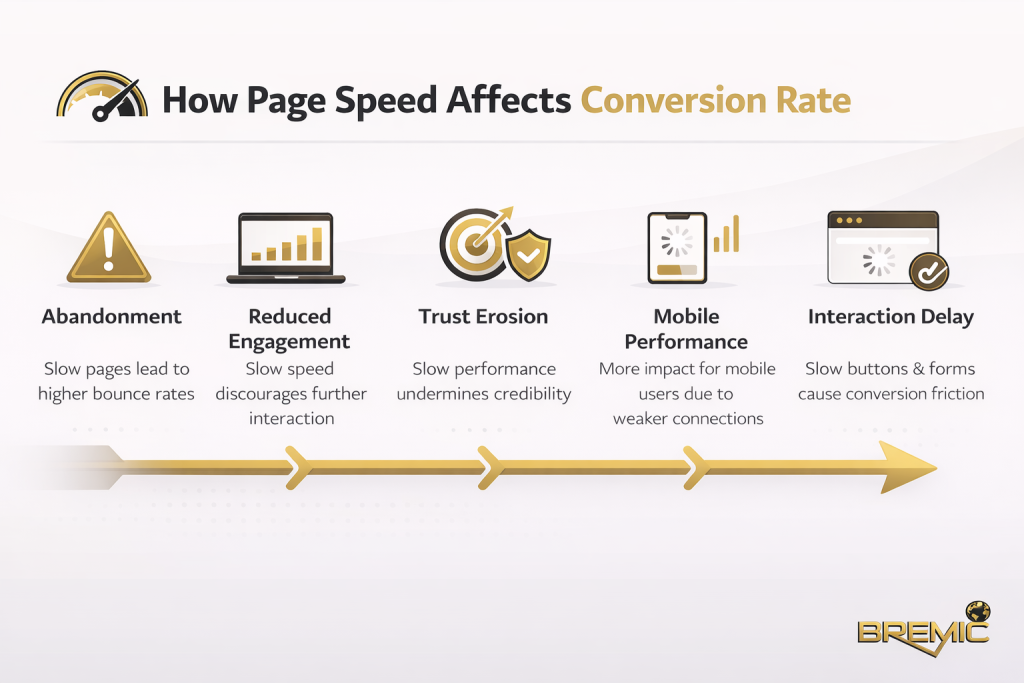
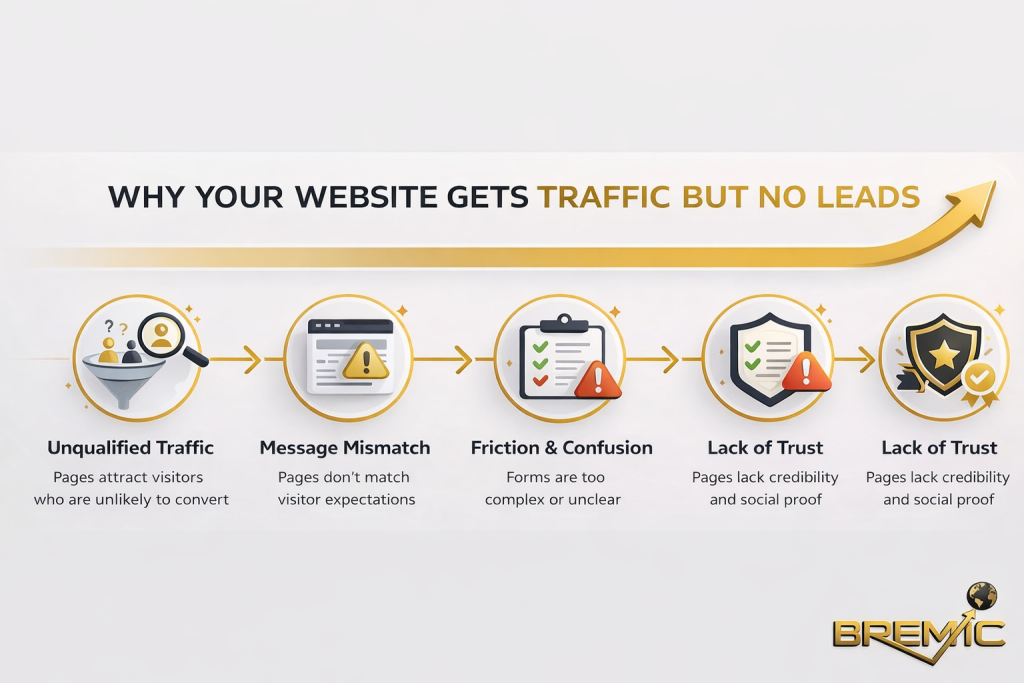
From an SEO perspective, traffic is only one part of the equation. Rankings can bring visibility, but visibility alone does not create leads or revenue. If your pages do not guide users toward a logical next step, you may be attracting the right audience while failing to capture the value of that attention.
This is where SEO and CRO intersect.
Search intent tells you why someone arrived on the page. CRO helps you determine what action makes sense once they are there. A high-performing page usually aligns these two things closely. Informational content may invite users to download a guide, explore related resources, or subscribe for future insights. Commercial pages may push toward demos, quotes, or product trials. The CTA should reflect the stage of awareness and level of commitment the visitor is ready for.
Strong CTAs also support topical authority indirectly. When cluster content guides users deeper into a site, it strengthens content pathways, improves internal engagement, and helps users navigate naturally from education to evaluation. That makes the site more useful, which is exactly the direction modern SEO should move in.
How it works: why some CTAs convert and others do not
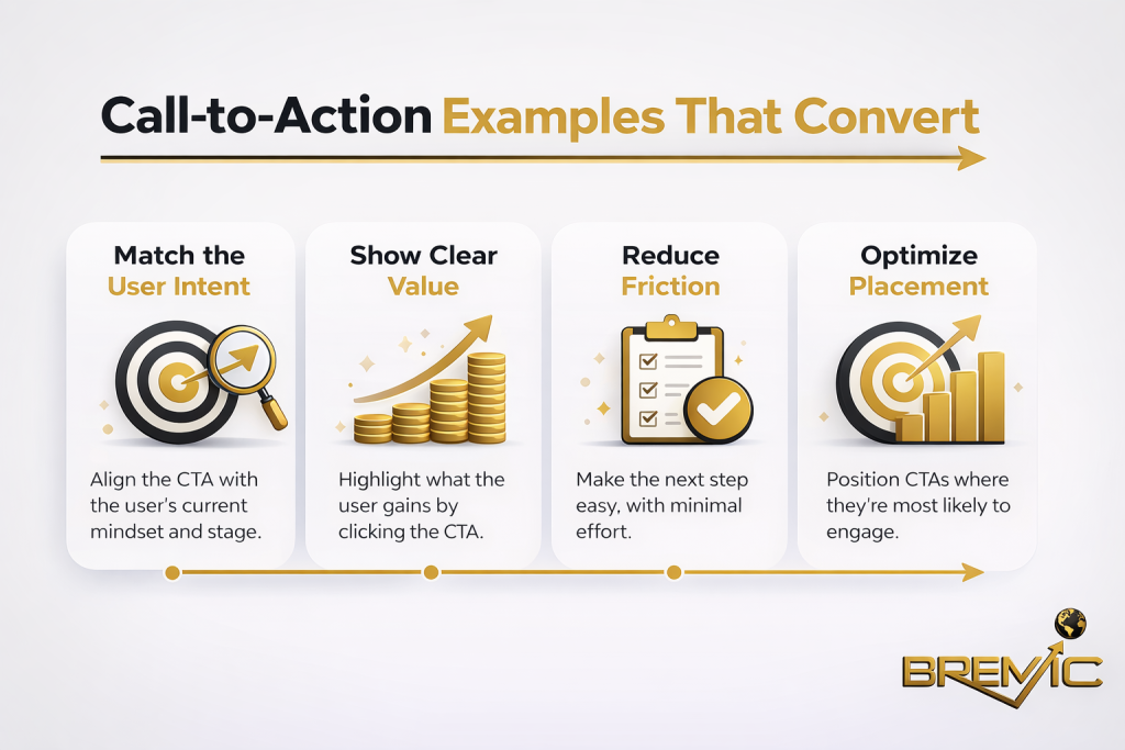
A CTA converts when three things are aligned: user intent, perceived value, and action clarity.
User intent comes first. A visitor on an educational blog post is rarely ready for the same ask as someone on a product comparison page. If the CTA demands too much too early, it creates resistance. If it is too weak for the stage of intent, it wastes momentum.
Perceived value is the next factor. People act when the next step feels worthwhile. “Submit” says very little. “Get your audit” or “See the demo” communicates a clearer benefit. The user understands what happens next and why it matters.
Action clarity is the final piece. Even a relevant offer will underperform if the wording is vague, generic, or disconnected from the page context. High-converting CTAs reduce ambiguity. They tell users exactly what they are doing and what they can expect after the click.
Call-to-action examples that convert in different contexts
The best CTA depends on the page type, traffic source, and user mindset. There is no universal formula, but there are reliable patterns.
Informational content CTAs
On blog posts and educational pages, visitors are often still researching. They need lower-friction next steps.
Examples include:
- Read the full guide
- Get the checklist
- Download the template
- See how the process works
- Explore related strategies
These work because they continue the learning journey rather than interrupt it with a hard sell. On informational pages, the CTA should feel like a natural extension of the content.
Lead generation CTAs
For service businesses and B2B websites, the next step often involves some form of contact or consultation. These CTAs must balance persuasion with trust.
Examples include:
- Request a tailored quote
- Book your strategy call
- Get a custom proposal
- Talk to a specialist
- See what is possible for your site
These tend to work when the surrounding page has already established credibility, clarified the offer, and reduced uncertainty about what happens next.
Product and SaaS CTAs
On product pages, users need direct language with a clear payoff.
Examples include:
- Start your free trial
- See the platform in action
- Create your account
- Compare plans
- Try it for yourself
Here, the CTA should support evaluation or activation. It should not ask users to guess what the click leads to.
E-commerce CTAs
For product-focused pages, urgency and clarity often matter more than cleverness.
Examples include:
- Add to cart
- Buy now
- Check availability
- Choose your size
- Complete your order
These work best when paired with strong product information, delivery details, returns information, and visible trust signals.
Important subtopics that shape CTA performance
Message match matters more than creativity
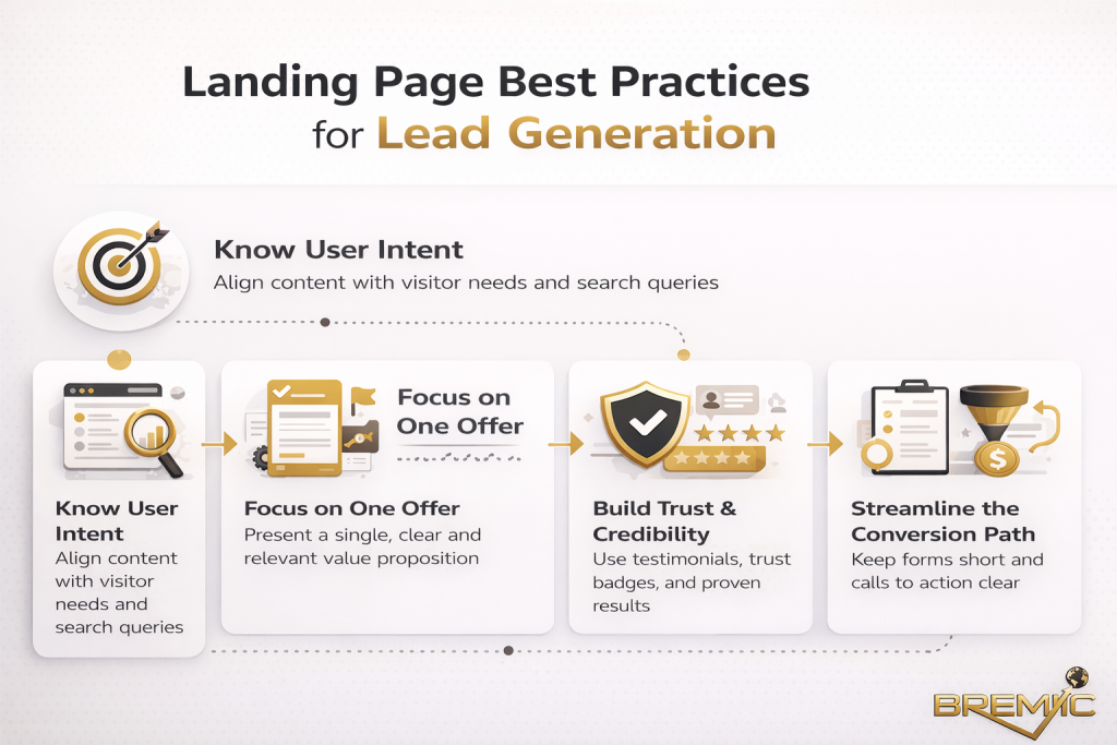
A CTA should feel consistent with the promise of the page. If a user arrives on an article about improving landing page performance, a CTA about booking a CRO consultation can make sense. A generic “Contact us” is usually weaker because it lacks connection to the page topic and user motivation.
The strongest CTAs are often less creative and more specific. Clarity usually outperforms clever phrasing.
Placement changes results
Even well-written CTAs can underperform if they appear at the wrong moment. Some users are ready early. Others need more context first. That is why placement matters.
A good page often includes a primary CTA in a prominent position, then repeats it or adapts it after the user has had time to absorb the content. On longer pages, mid-content CTAs can perform well if they follow a strong section and feel earned rather than forced.
Friction reduction is part of the CTA
The wording on the button matters, but so does everything around it. A CTA converts more easily when the user sees reassurance nearby. That may include a short explanation, a privacy note, a testimonial, a product screenshot, a delivery promise, or simple context about what happens next.
In CRO terms, the CTA does not work alone. It works as part of a conversion environment.
Common mistakes
Many underperforming CTAs fail for predictable reasons.
Asking for too much too soon
A first-time visitor reading an informational article may not be ready to “Book a demo” or “Talk to sales.” That ask may be appropriate later, but not as the first conversion step.
Using generic wording
Words like “Submit,” “Click here,” and “Learn more” are often too weak on their own. They do not communicate value clearly enough, especially on high-intent pages.
Ignoring search intent
A CTA that does not match the reason the user came to the page will struggle. Informational visitors usually need guidance, not pressure. Commercial visitors need decisiveness, not vague next steps.
Treating every page the same
One of the most common mistakes in SEO-led websites is repeating the same CTA across every page regardless of audience stage. That creates inconsistency between the content goal and the conversion goal.
Overwriting the CTA
Some brands try too hard to sound clever or unique. The result is often a button or instruction that sounds branded but does not communicate action clearly. Conversion usually benefits from precision more than personality.
Practical guidance for writing better CTAs
Start by identifying the real purpose of the page. Then define the most logical next action for that stage of the journey. This sounds simple, but it is where many pages go wrong. The CTA should not be based on what the business wants most. It should be based on what the user is ready for next.
Write the CTA around a clear benefit. Instead of defaulting to generic action verbs, think about what the user receives or progresses toward. “Get your audit” is stronger than “Submit.” “See pricing” is clearer than “Learn more.”
Keep the wording specific. A strong CTA usually answers one of these questions:
- What am I getting?
- What happens after I click?
- Why should I do this now?
Also pay attention to the surrounding copy. A short line above the CTA can often do more conversion work than changing the button text alone. For example, explaining that the consultation is tailored, the download is practical, or the trial requires no commitment can remove hesitation.
Finally, test with discipline. In Conversion Rate Optimization (CRO), strong opinions are less useful than strong evidence. What converts best depends on audience, offer, page type, and traffic quality. Use patterns as a starting point, then validate them against real behavior.
Timing and expectations
CTA improvements can produce relatively fast results compared with broader SEO initiatives, but that does not mean outcomes are instant or dramatic. Small wording changes sometimes help, but the biggest gains usually come from better alignment between page intent, offer strength, and user journey design.
If your traffic is low, it may take time to gather enough data to judge performance confidently. If your traffic is high, testing and iteration can reveal useful patterns more quickly. Either way, meaningful improvement usually comes from ongoing refinement, not one-off copy edits.
It is also worth remembering that a CTA cannot rescue a weak page. If the offer is unclear, the content misses intent, or the page lacks trust, better button copy alone will not solve the problem.
Conclusion
The best call-to-action examples that convert are rarely the flashiest. They work because they are relevant, clear, specific, and well matched to the page context. That is the real connection between CTAs and Conversion Rate Optimization (CRO): both aim to make the next step easier for the right user at the right time.
For SEO-driven websites, this matters more than many teams realize. Traffic without action is only partial success. A well-structured content strategy should not just attract visitors. It should guide them logically through the site, support intent at each stage, and create credible paths toward conversion.
If you want stronger results, do not start by looking for magic words. Start by asking a better question: what is the most natural next step for this visitor, on this page, at this moment? When that answer is clear, the CTA usually becomes clearer too.